How we measure hotel weather
A price tells you what a month costs. The other column tells you what it feels like.
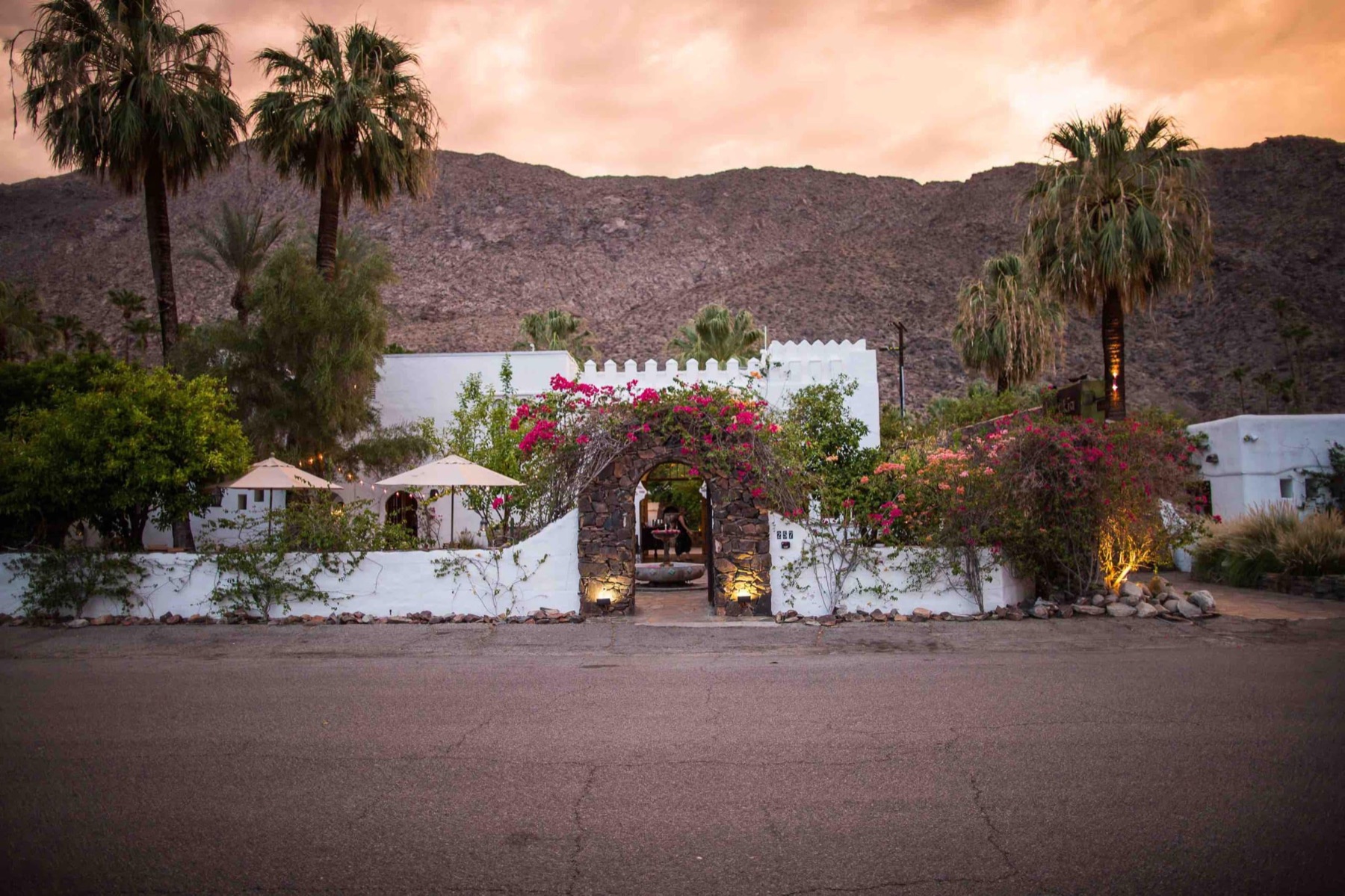
A price alone can flatter a month. The cheapest weeks at a desert hotel are cheap for a reason, and a rate table that hides the reason is selling you something. So every rates-by-month table on Off Peak now carries a second column: the average daily high and low for each month, printed beside what the month costs. As this is written, June at Korakia in Palm Springs shows $239 a night and 105 degrees, in the same row. Some travelers will read that row and book it, a pool and a bargain in an empty town. Others will scroll to October. Both are choosing with open eyes, which is the entire point.
Where the numbers come from
The temperatures are not pulled from a weather widget. They come from ERA5, the Copernicus Climate Change Service's reconstruction of the actual atmosphere, hour by hour, over the whole planet. We take the last ten years of it and compute, for each hotel, the average daily high and low for every month of the year. Not a forecast, and not a single lucky or unlucky season: ten years of measured weather, distilled to what a month typically does.
The problem with weather data
Climate data has an honesty problem of its own. The numbers describe grid squares many kilometres wide, and a square can average a sun-baked valley floor together with the mountains above it. A hotel by the sea can inherit the temperature of the ridge behind it. Left uncorrected, those numbers look authoritative and run degrees warm or cold.
So we correct them. Every hotel's figures are adjusted for the difference between its true elevation and its grid square's average. Then we go further: where a genuinely well-matched weather station exists near a hotel, close by and at its elevation, we calibrate that hotel's numbers against the station's actual thermometer readings.
A published temperature is a claim. We prefer the ones a thermometer can defend.
Where we stay silent
Some places defeat the method honestly. A high alpine resort can sit inside a grid square that mostly averages the valley below it, and no correction we trust can bridge that gap. At those hotels the temperature column shows a dash. It is the same rule we apply to rates: we would rather show you nothing than show you a plausible-looking guess.
A warming world
The ten-year window rolls forward every year, so the numbers quietly track the climate as it actually moves rather than preserving a textbook average from decades ago. When a destination's shoulder season shifts, our table shifts with it.
The rate column and the temperature column hold each other honest. One says what a month costs, the other says what it feels like, and the trade between them is yours to judge. That is what off-peak means here: the price dropped and the place is still itself. Now you can see both halves of the deal.
Climate figures contain modified Copernicus Climate Change Service information 2026. The corrections and calibration are our own.